Using the Spectrum Views
Opening the Spectrum app automatically changes the screen orientation and opens the default view: a Frequency Spectrum graph for the 2.4 GHz band. You can choose from three views of live data: Frequency Spectrum (heatmap), Waterfall, and Real Time.
See Spectrum Settings for instructions on changing the frequency band, changing the Waterfall View type, enabling the External Antenna, and saving settings.
In this Topic
Uploading Results to Link-Live
Locating a Source of Interference
Before You Begin
-
Connect NetAlly's Portable Spectrum Analyzer to the top USB port (USB Type-A) on your EtherScope nXG.
-
To get more accurate test results, NetAlly recommends that you turn off your device's Wi-Fi Management Port and Bluetooth. (The Spectrum app notifies you if these services are turned on.)
To turn off management Wi-Fi and Bluetooth:
-
Swipe down from the top of the EtherScope screen to display the Quick Settings system icons.
-
Tap the Wi-Fi- icon
 to disable the system Wi-Fi radio
  .
. -
Tap the Bluetooth icon
 to disable the Bluetooth function
  .
.
-
Common Spectrum Actions
Use these actions in each Spectrum graph to change the view details:
-
 Pause: Tap the Pause icon to stop updates of the display. This can help you examine patterns and anomalies without updated data overriding your current view.
 -
 Resume: Tap the Resume icon to cancel pause and continue live data updates.
 -
 Refresh: Tap the Refresh icon to clear the graph and start acquiring new data. (Refreshing also cancels pause.)
 -
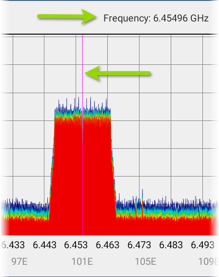
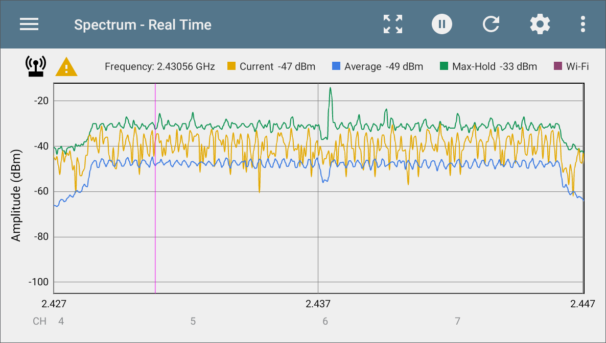
Display markers: (Frequency Spectrum and Real Time views only) Tap the graph at a particular frequency that you want to examine. A pink vertical marker displays where you tapped, and the precise Frequency is shown above the graph.
-
The Frequency Spectrum view displays the selected frequency and its maximum value.
-
The Real Time view displays the frequency, the frequency's current value, the average value, and the highest measured value (Max-Hold).
-
Tapping on the marker erases it. Reset the marker by single-tapping the graph again.
-
-
Zoom in: Double-tap in any of the graphs to zoom in incrementally to a narrower range around a particular frequency. Double-tap again to zoom in further. When using an NXT-2000, the maximum zoomed-in range for all graphs is 20 MHz. (If you are using an NXT-1000, only one zoom level is supported.)
-
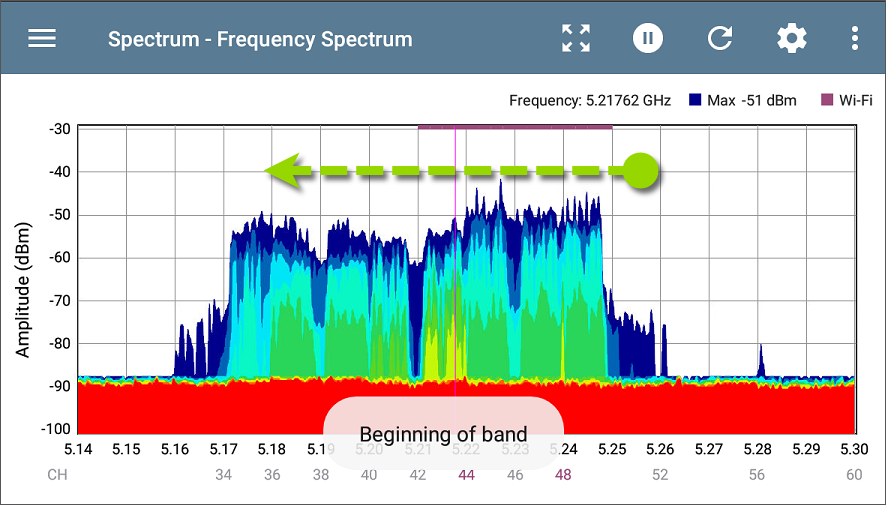
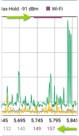
Fling: When zoomed in on a frequency range, you can use a fling gesture to shift the view higher or lower within the band. To fling, swipe quickly across the graph and lift your finger. After the gesture, the graph updates to reposition the display, showing the next two-thirds of the frequency range. One-third of the previous view remains visible for context. (If you are using an NXT-1000, the Fling motion is not supported.)
For example, in the image below, the graph is displaying the lowest portion of the 5-GHz frequency band, from 5.14 to 5.30. The user can touch and fling towards the left to view the next higher two thirds of the displayed frequency range. The last third of the previously displayed range, on the right, will redraw on the left side of the view.
-
 Restore to normal view: Tap the Restore icon to zoom back out to the full display for the frequency band. (If you are using an NXT-1000, the graph refreshes with new data.)
 -
Saving results: You can save your Spectrum results locally or upload to Link-Live. See Uploading Results to Link-Live.
Indicator Icons
-
 External Antenna: This icon displays when the External Antenna setting is enabled and measurements are being collected from the external antenna connection. Ensure your External Antenna is connected to the NXT-2000 Analyzer when this icon is displayed. See Locating a Source of Interference.
 -
 RF Saturation: If this icon displays near the top left of a Spectrum view, you may be too close to a RF source. Move back from the source, and see RF Saturation for more details.
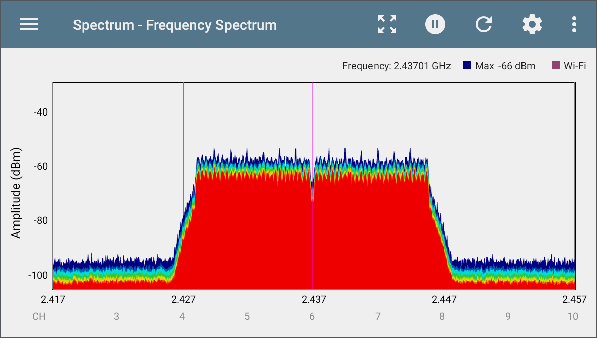
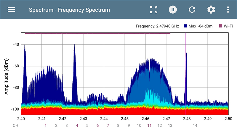
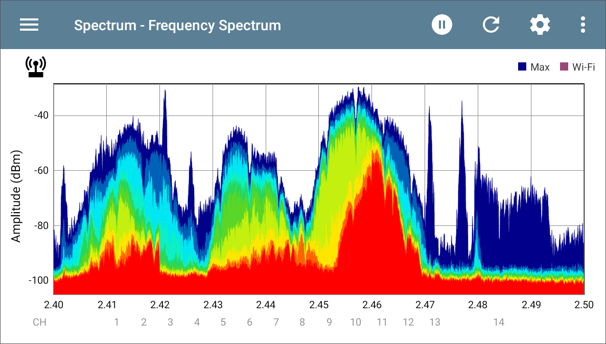
Frequency Spectrum View
This display uses the color spectrum to present a heatmap of the frequency band you have chosen, showing the density of recent RF measurements.
The graph below was created using a signal generator, so measurements are relatively uniform across the affected channels.
-
Blues and greens ("cool" colors) indicate less RF detected at that frequency and amplitude.
-
Yellow, orange, and red ("hot" colors) indicate the repeated presence of RF at that frequency and amplitude.
-
Darkest blue indicates infrequent RF while red indicates the continuous presence of RF at that amplitude.
-
The range for the Y-axis (Amplitude) scales automatically according to data values.
-
The X-axis displays channels and frequencies and zooms incrementally when double-tapped.
-
The top of the chart shows the precise numbers for the display marker you have set.
-
When the Wi-Fi Test Port is enabled, the Frequency Spectrum graph shows active Wi-Fi APs and clients by coloring the channel numbers purple and by displaying a purple bar across the active Wi-Fi frequency range at the top of the chart.
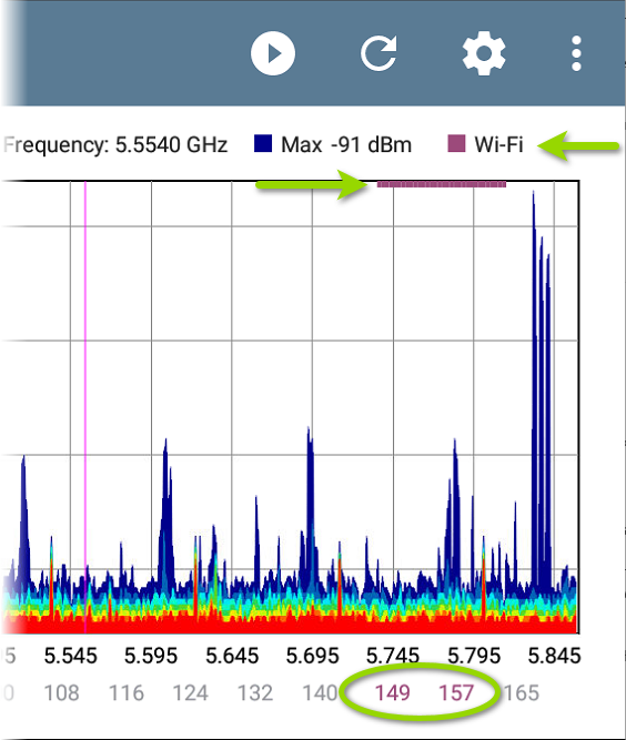
NOTE: You can enable or disable the Wi-Fi Test Port from the General Settings in the navigation drawer for any testing app.
The following image puts everything together with variable traffic, a display marker set at 2.479 GHz, Wi-Fi indicators, and 2-MHz wide Bluetooth signals:
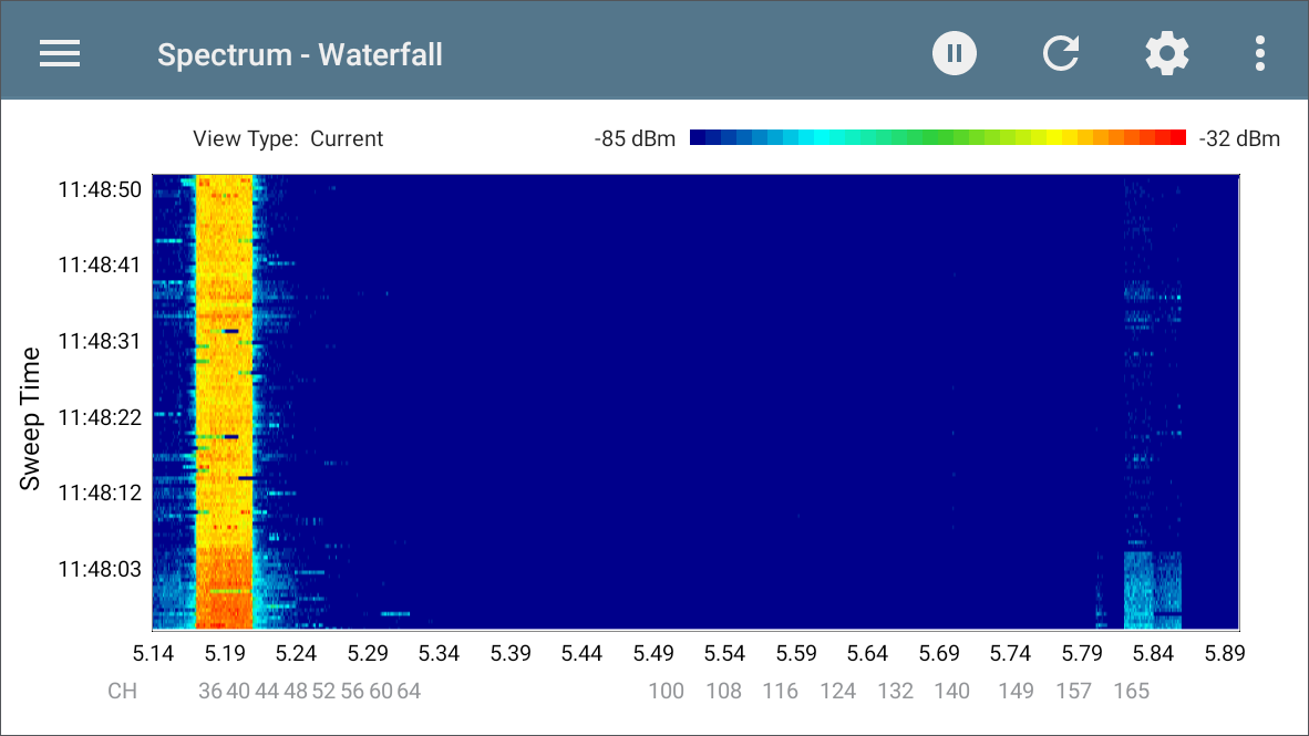
Waterfall View
The Waterfall plot draws new data at the top of the display as it scrolls older data downwards over a period of time. This provides a visualization of historical signal measurements and channel utilization.
-
The vertical axis shows the time, and the horizontal axis shows frequencies and channels.
-
The colors in the waterfall represent the amplitude of a frequency at a certain time according to the scale in the upper right. Blue shows lower amplitude measurements, and lighter colors show higher amplitude signals.
-
Dark blue indicates no or low channel utilization while a more solid bar of bright colors indicates high utilization.
-
The waterfall has two view types. Use Current to detect instantaneous RF. To smooth the data and see overall usage, change the type to Average 5 Sweeps, which averages five sweeps for each new line of data. This decreases the data resolution but may make the data easier to interpret in highly active RF environments. (See Changing Spectrum Settings for instructions on changing the type.)
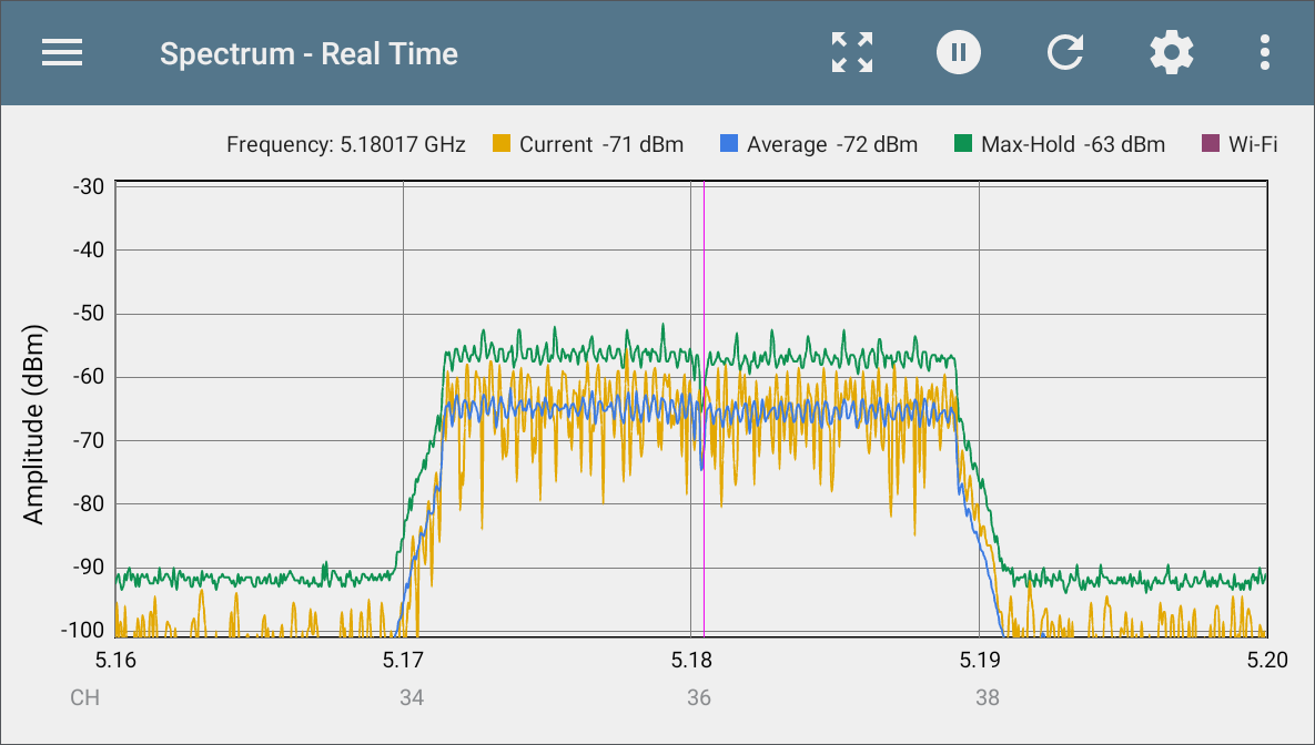
Real Time View
The Real Time display shows the current, average, and max values across the frequency band.
-
The yellow line indicates the current values.
-
The blue line indicates the average values, which are calculated using all measurements accumulated since the graph was last cleared.
-
The green line indicates the highest measured value (Max-Hold).
-
The top of the chart shows numerical details for the display marker.
-
The range for the Y-axis (Amplitude) scales automatically according to data values.
-
The X-axis displays channels and frequencies.
-
When the Wi-Fi Test Port is enabled, the Real Time graph shows active Wi-Fi APs and clients by colorizing the channel numbers and by displaying a purple bar across the active Wi-Fi frequency range at the top of the chart.
You can enable or disable the Wi-Fi Test Port from the General Settings in the navigation drawer for any testing app.
Uploading Results to Link-Live
To send your Spectrum results to the Link-Live website, tap the action overflow icon  at the top right of the Spectrum screen, and then tap Upload graph to Link-Live. The Link-Live upload screen opens.
The system creates a file name for the upload automatically using the date. You can also enter optional Comments and Job Comments to attach to the results file. The results are displayed as images on Link-Live.com.
Locating a Source of Interference
Testing device kits that include an NXT-2000 Portable Spectrum Analyzer also contain an optional External Directional Antenna. The External Antenna connects to the NXT-2000 to assist with signal amplification for locating specific sources of interference.
The External Antenna setting must be enabled in the Spectrum App settings if you are using the NXT-2000 with the External Antenna. The antenna icon displays to the top left of the Spectrum graph when the setting is enabled.
Attach the antenna to the NXT-2000 as show below, and point the External Antenna towards the source of interference.


See the NXT-2000 Portable Spectrum Analyzer Instruction Sheet for more images and details of the External Antenna cable assembly.
For more accurate RF detection when locating, turn off your tester’s radios for Test and Management Wi-Fi and for Bluetooth:
-
Disable Wi-Fi Management and Bluetooth from the Quick Settings by tapping their icons.
-
Optionally, also disable the Wi-Fi Test Port in the General Settings from any testing App on your device.
NOTE: The Spectrum app will not indicate Wi-Fi activity (purple bars and channel numbers) while the Wi-Fi Test Port is disabled.
Point the target symbol on the External Antenna towards the source of interference you are searching for.
RF Saturation
RF Saturation: When this icon displays, the NXT-2000 detects radio frequency saturation (Analog-to-Digital converter overflows), and the Spectrum graph may display unreliable data.
Move away and maintain a small distance from the RF source to avoid over-saturating the NXT-2000 sensors.