Trending Graphs
Many of the EtherScope nXG testing apps feature time-based line graphs of recorded measurements, which you can pan and zoom to view different time intervals.
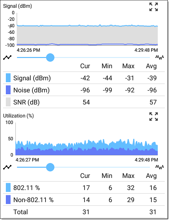
The graphs update in real time and then save and display data for up to 24 hours (depending on test type and/or link status).
A legend indicates the measurements that correspond to each plotted color.
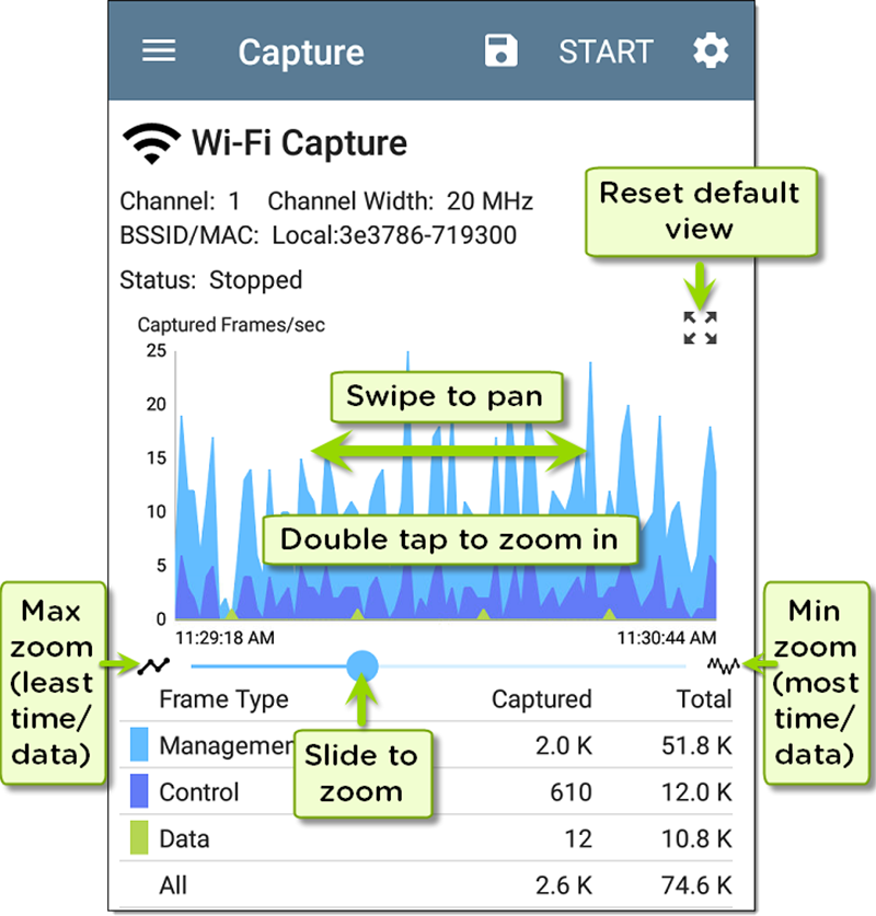
For another example, the image below shows the Capture app graph.
-
To pan, or move backward and forward in time, touch and drag (swipe) left and right on each graph.
-
To zoom in on a specific point, double tap the point on the graph. The view zooms in 2x (or displays half the amount of time) for each double tap.
-
To zoom in or out, decreasing or increasing the time interval displayed, drag the slider or tap the slider bar below the graphs.
-
The largest time interval (maximum zoom out) is the total time data has accumulated.
-
-
To reset the graph to the default time interval, tap the zoom reset icon
 .
. -
The zoom reset icon appears after you zoom or pan on the graph.
-
The default time interval varies across different apps.
-
The following apps and screens contain trending graphs: