To most users, Wi-Fi is invisible magic. To network engineers, that invisibility is a constant challenge. You can’t fix what you can’t see. When users complain that “the Wi-Fi sucks” in the conference room, staring at the access point (AP) won’t tell you if it’s a coverage gap, a channel conflict, or just the microwave in the breakroom nuking the 2.4GHz band.
This is where Wi-Fi heatmaps come in. They turn invisible RF chaos into actionable data you can analyze and fix. Think of it like an MRI for your network – stripping away the guesswork and showing you exactly where your signal is strong, where it’s weak, and where interference is impacting performance.
In this guide, we’ll break down exactly what a heatmap is, why you need one, and how to use a professional Wi-Fi analyzer to create one that provides genuine insight rather than just pretty colors.
What is a Wi-Fi heatmap?
A Wi-Fi heatmap – often called a Wi-Fi coverage map or visualization – is a visual representation of wireless data overlaid on a floor plan of your site. It uses a color-coded spectrum – usually blue for “good” (strong signal) and red for “bad” (weak signal) – to show how radio frequencies (RF) behave in the real world.
However, effective heatmapping requires understanding the two main categories:
- Design-Phase (Predictive) Heatmaps: This is the “theoretical” map used for Wi-Fi planning. You use Wi-Fi heatmap software like AirMagnet® Survey PRO to draw walls, place virtual APs, and simulate how the signal should propagate. It’s the blueprint you create before drilling a single hole.
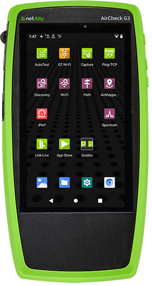
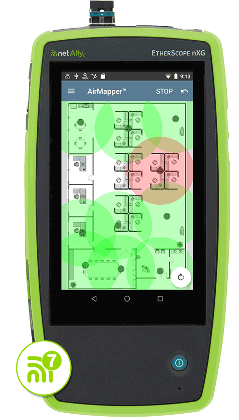
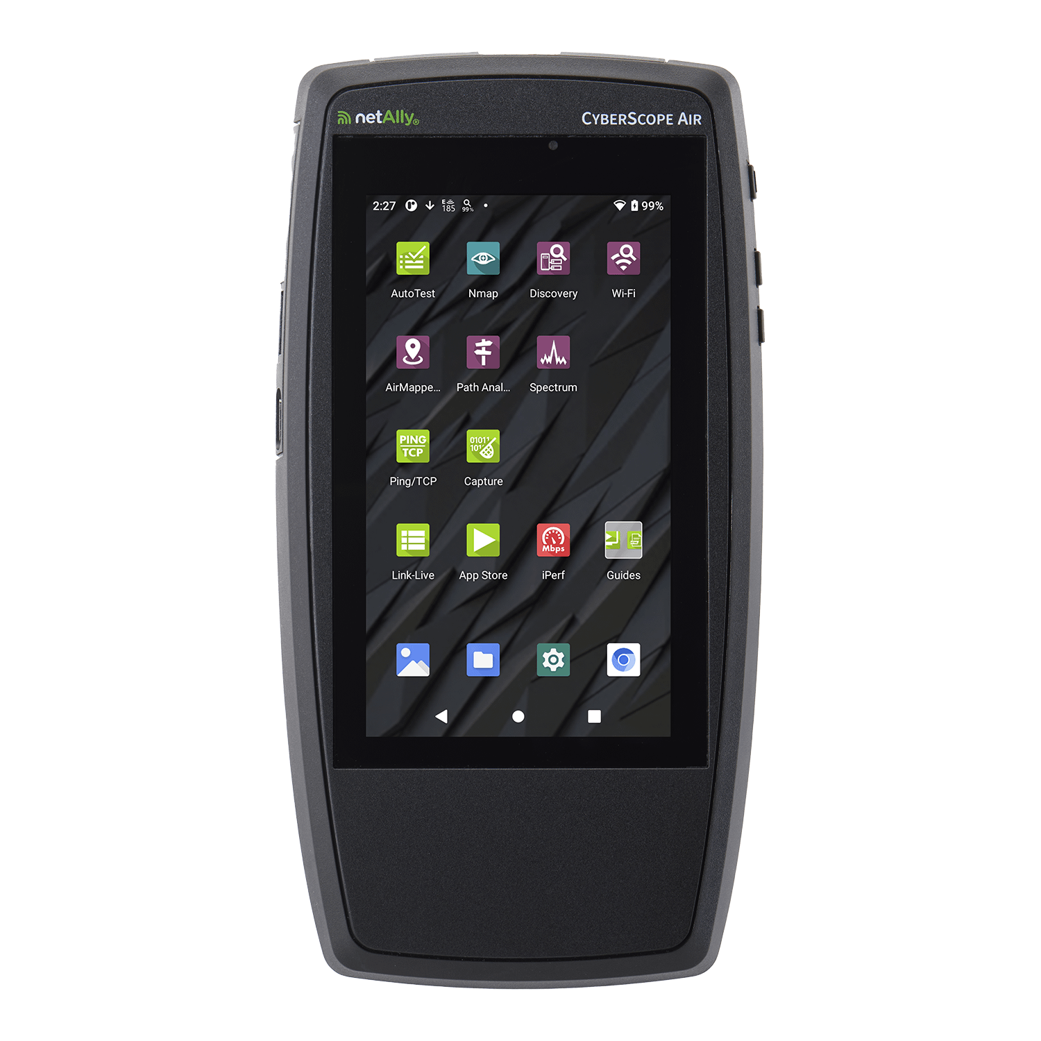
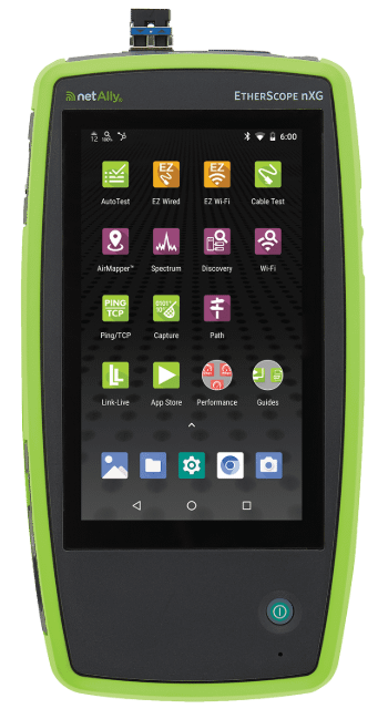
- Validation (Real-World) Heatmaps: This is the “reality check.” You use a tool like the EtherScope® nXG, AirCheck® G3 or CyberScope® to walk the site and measure the actual RF environment. Concrete walls often contain metal rebar you didn’t account for, and that “open space” might now be filled with metal filing cabinets.
Why use a Wi-Fi heatmap?
Simply placing APs where they look good isn’t a strategy. Beyond saving you from troubleshooting headaches, heatmaps offer serious business ROI.
- Stop the Blame Game: When the network is slow, the network engineer is usually the first suspect. A heatmap gives you hard data to prove the network is performing correctly (and that the issue might be the client device).
- Visualize the Invisible: Instantly spot dead zones, bleed-through from neighboring floors, and channel overlap.
- Smarter Planning: Instead of the “spray and pray” method of adding more APs (which often worsens interference), you can place them exactly where they’re needed.
- Save Time & Money: NetAlly users report cutting troubleshooting time by up to 60% just by having the right visibility. That’s less time chasing ghosts and more time working on strategic projects.
Types of Wi-Fi heatmaps
Most people stop at “Signal Strength,” but that’s just scratching the surface. If you’re using NetAlly’s Link-Live™ collaboration platform, you have access to 14 different visualizations that tell the whole story. Here are the heavy hitters:
- Signal Strength: The classic view. This Wi-Fi signal strength map shows RSSI (Received Signal Strength Indicator) in dBm.
- Signal-to-Noise Ratio (SNR): The truth-teller. A strong signal means nothing if the noise floor is high. This map shows the quality of the connection.
- Noise: Visualizes ambient RF energy that could drown out your Wi-Fi signals.
- Co-Channel Interference: Shows where APs are stepping on each other’s toes by talking on the same channel.
- Adjacent Channel Interference (ACI): Highlights interference from APs on overlapping channels (a common killer in the 2.4GHz band).
- AP Coverage: Visualizes redundancy. If an AP dies, who picks up the slack?
- Min Basic Rate: Shows the minimum speed required for management traffic.
- Beacon Overhead: Is your airtime being hogged by APs just announcing they exist?
- Max TX/RX Rates: The theoretical speed limit of your Wi-Fi network.
- Max TX/RX MCS: Visualizes the complexity of the data coding scheme (higher is better/faster).
- QBSS Utilization: Provides visibility into how busy the channels being used are (low is better/faster).
- QBSS Station Count: Shows how many client devices are connected to your network.
- First AP Coverage: Ensures your primary coverage meets minimum requirements (e.g., -65 dBm).
- Secondary AP Coverage: Verifies you have backup coverage for seamless roaming.
Pro Tip:
Don’t ignore the “Noise” heatmap. Everyone obsesses over signal strength, but noise is the silent killer of Wi-Fi performance. You can have a screaming loud signal (-40 dBm), but if your noise floor is also high due to non-Wi-Fi interference (like Bluetooth, microwaves, or security cameras), your SNR will tank, and your users will suffer. Always validate SNR alongside Signal Strength.
How to create a Wi-Fi heatmap
Creating a heatmap isn’t just walking around aimlessly. To get data you can trust, you need a process. Here’s how we do it with AirMapper™ Site Survey:
- Prep the Floor Plan: Get a clean image of the map.
- Upload it: Create a new site survey project in Link-Live and upload the map.
- Crop: Remove areas of the floor plan that you won’t be surveying by cropping the image.
- Calibrate: This is crucial. Draw a line on the map (like a wall) and tell the tool “this is 10 feet long.” If you skip this, your site survey data will be inaccurate.
- Push it: Send the map to your AirCheck G3, EtherScope nXG or CyberScope®.
- Choose your Path:
- AutoSampling: You walk, the tool records. Good for large open spaces.
- Click-to-Sample: You stop, tap the screen, and it records. Better for those new to the world of Wi-Fi site surveys, or spot checking.
- Walk the Walk: Move through the site. Don’t just stick to the main hallways – go where the users sit. Go into the corners.
- Upload & Analyze: Push the data to Link-Live. This is where you can toggle between those 14 different heatmap types we mentioned earlier.
How to read and interpret a Wi-Fi heatmap
Once you have your data, look for specific patterns that indicate trouble.
Look for the “Swiss Cheese” Effect: On your AP Coverage map, look for holes. If you see yellow or orange spots in areas where people actually work, you’ve found your dead zones.
Check for “Traffic Jams”: Pull up the Co-Channel Interference map. If you see bright orange areas, it means too many APs are shouting over each other on the same channel. This causes contention, meaning devices have to wait their turn to speak, slowing everything down.
Analyze Data Rates: Compare your Signal Strength map with your Max TX/RX Rates map. If you have strong signal (green) but low data rates (orange), you might be dealing with legacy devices dragging the network down, or hidden interference forcing devices to shift to slower, more robust modulation schemes.
Common Wi-Fi problems revealed by heatmaps
Heatmaps are excellent at exposing the gremlins hiding in your RF environment:
- Dead Zones: Usually caused by physical obstructions you didn’t account for, like a new concrete elevator shaft or metal-lined breakroom walls.
- Roaming Issues: If your Secondary AP Coverage map is blank, your users will drop calls when they walk down the hall because there’s no backup AP to hand off to.
- Bleed-Through: Seeing a strong signal from the floor above? That’s not a bonus; that’s interference. It ruins your channel planning.
- The “Sticky Client” Problem: Sometimes a heatmap shows you have too much power. If an AP is blasting at full volume, devices will cling to it even when they’re far away, rather than roaming to a closer AP that provides better performance.
Pro Tip:
Don’t have time to analyze heatmap data, or need help identifying the root cause of Wi-Fi network performance problems? The InSites engine in Link-Live simplifies the process by automatically comparing your site survey data against a set of customizable thresholds and giving you a quick pass or fail.
Choosing the right Wi-Fi heatmap tool
This really comes down to where you are in the project lifecycle. When selecting a Wi-Fi heatmap tool, consider your specific needs:
For Planning & Design:
You need AirMagnet® Survey PRO. This is the industry standard for predictive modeling. You can simulate walls, materials, and AP placement to get a “Bill of Materials” before you even buy the hardware. It’s about getting it right the first time.
For Validation & Troubleshooting:
You need a robust Wi-Fi site survey solution like AirMapper™ Site Survey. This runs on our handheld tools. It’s for when the network is live and you need to see what’s actually happening. Unlike a basic Wi-Fi heat mapping tool that might run on a laptop or phone, dedicated hardware ensures you measure what the network really looks like, not just what your laptop antenna sees.
Wi-Fi heatmap best practices
To ensure your data is reliable, follow these rules:
- Calibrate, Calibrate, Calibrate: If your scale is wrong, your heatmap is fiction.
- Survey All Bands: 2.4GHz and 5GHz (and 6GHz!) behave very differently. 2.4GHz punches through walls; 5GHz bounces off them. Surveying only one band gives you half the picture.
- Mind Your Body: Your body is a bag of salt water that blocks RF signals. Don’t hunch over the tester. Hold it up and away from you.
- Mimic the User: Don’t hold the tester near the ceiling if your users are sitting at desks. Survey at the height where the actual devices will be used.
- More is Better: Collect as many site survey data points as possible. The more data you have, the more accurate and colorful your heatmaps will be.
Conclusion
A Wi-Fi heatmap isn’t just a pretty chart to put in a report; it’s the difference between guessing and knowing. It turns the invisible physics of RF into actionable data that saves you time, money, and frustration. Whether you’re planning a new deployment or hunting down a ghost in the machine, you need the right visibility.
Ready to stop guessing? Check out our professional tools that make mapping simple:
- AirMapper™ Site Survey: The app that runs on our handhelds for fast, easy, professional surveys.
- AirMagnet® Survey PRO: The gold standard for predictive Wi-Fi design and planning.